REIMAGINING AN ICON
SUMMARY
For more than 60 years Nesquik has been known for its ability to turn milk into a unique irresistible chocolate milk beverage.
As it became a firm favourite with many children and adults alike, Quiky was introduced as the face of the brand and he has since gained a somewhat iconic status.
Over recent years his appearance hadn't really moved with the times and he found himself looking a little dated and out of touch.
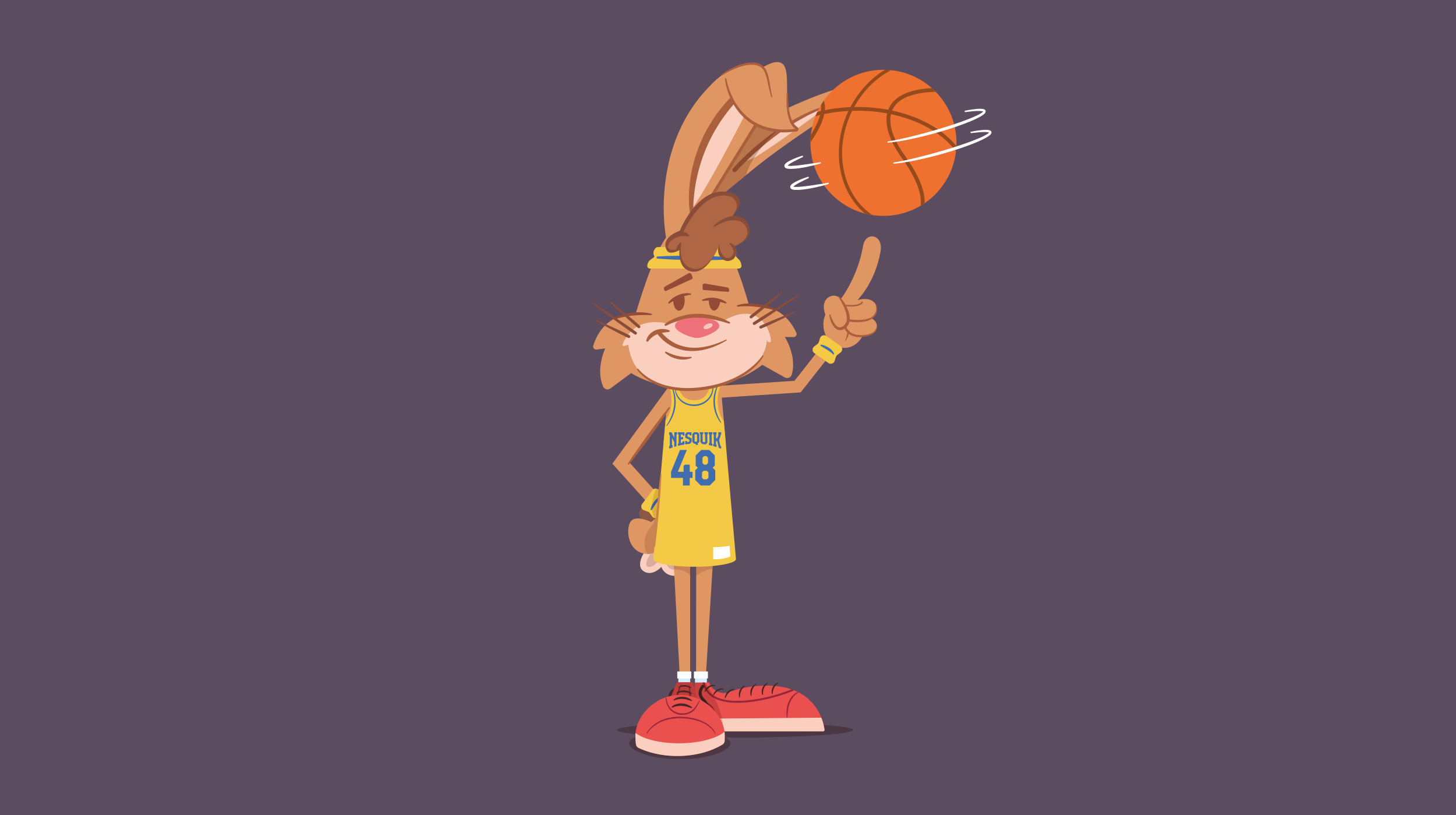
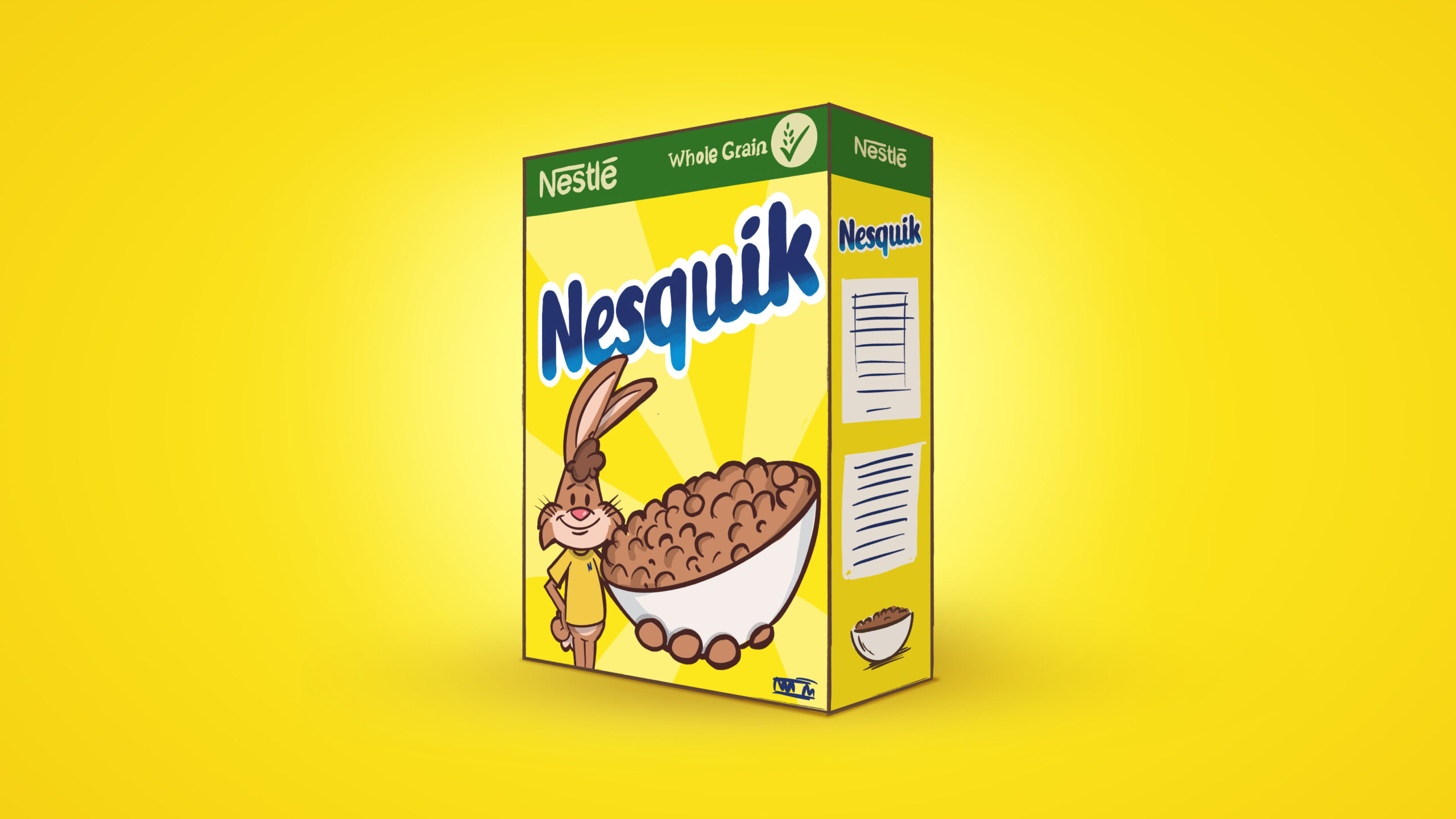
My challenge, along with a handful of other illustrators, was to look at how we could update Quiky to make him a little more modern and relevant in today's world, yet making sure we didn't lose any of his character. All of the selected creatives had varying styles which helped Nestlé explore the best possible executions for their beloved rabbit.
CLIENT: Nestlé AGENCY: FutureBrand
SCOPE: Art direction, character design
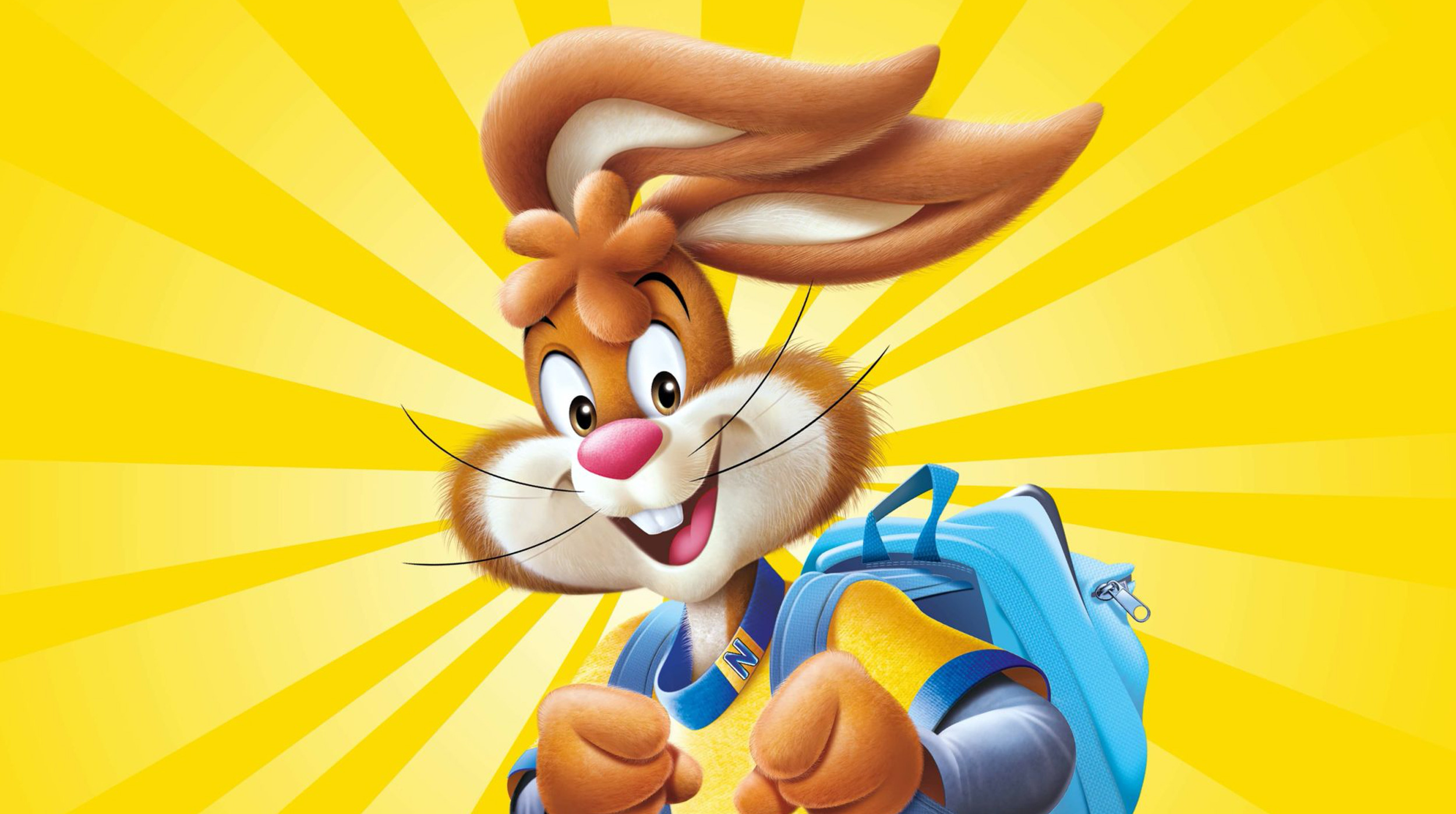
This was Quiky's original look. It was imperative we kept his core iconic features, but modernise his style and appearance.
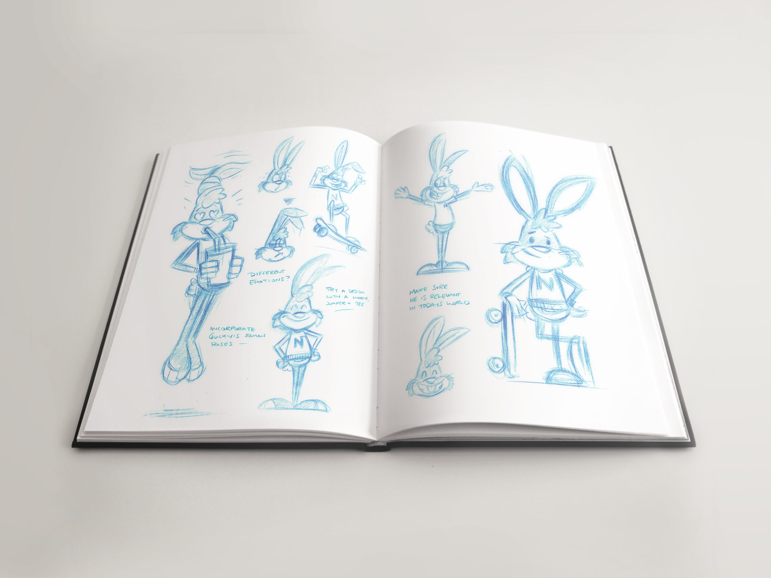
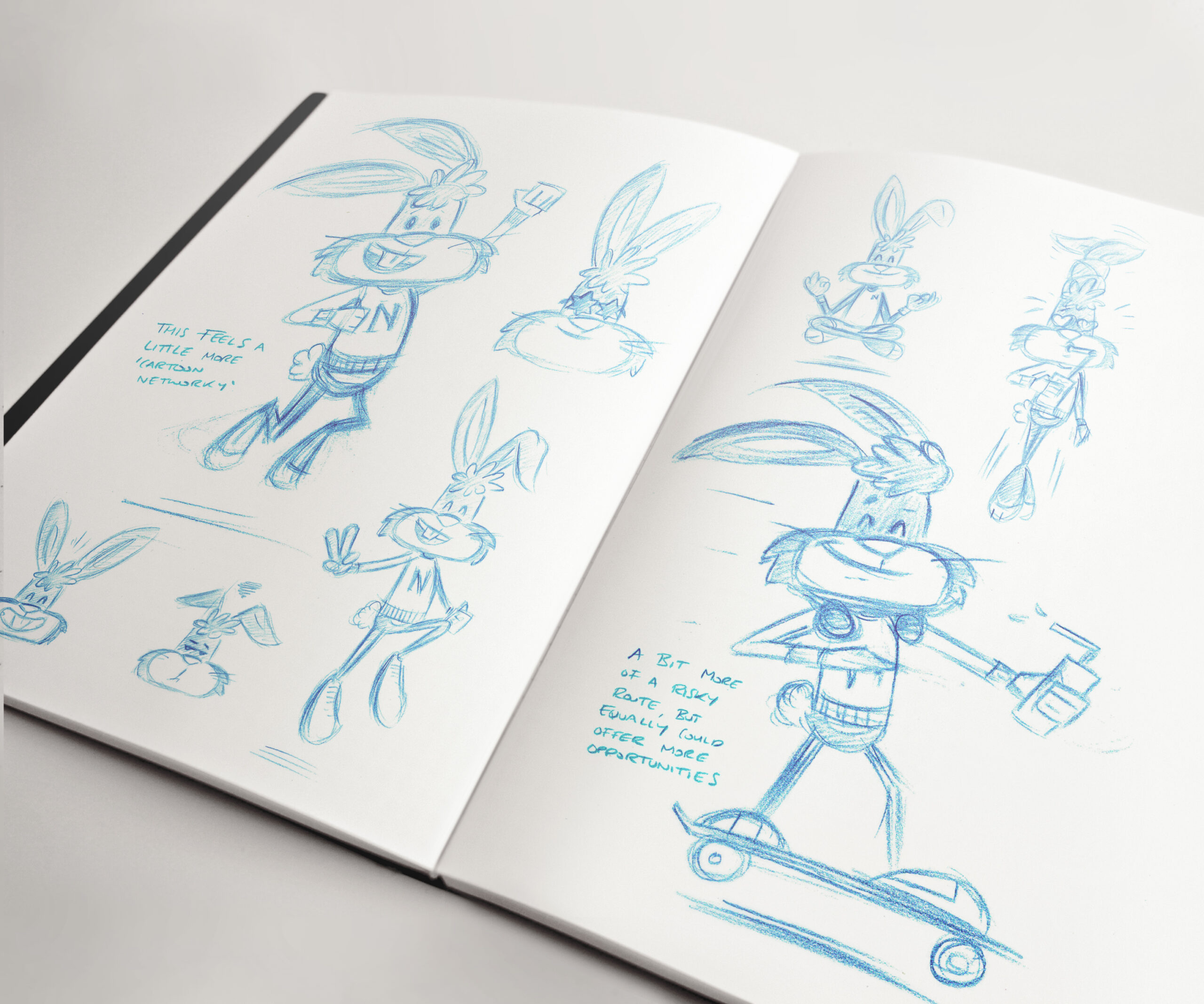
I originally presented two varying styles for Quiky. One felt like a natural evolution of the character, whereas the other pushed the boundaries a little more. The safer route was the chosen design to explore and we also looked at an option with and without a keyline.
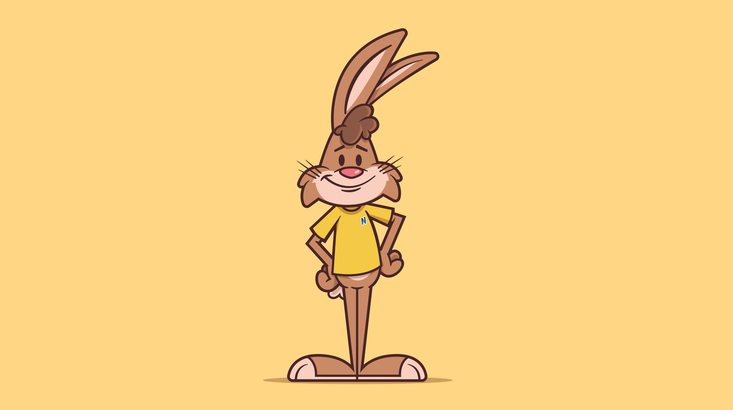
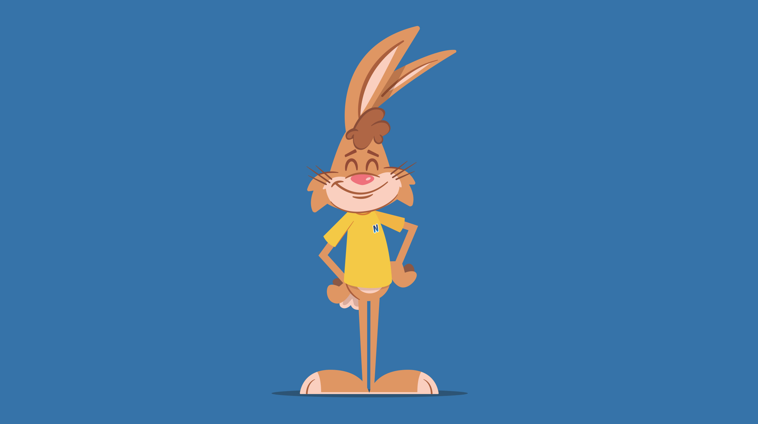
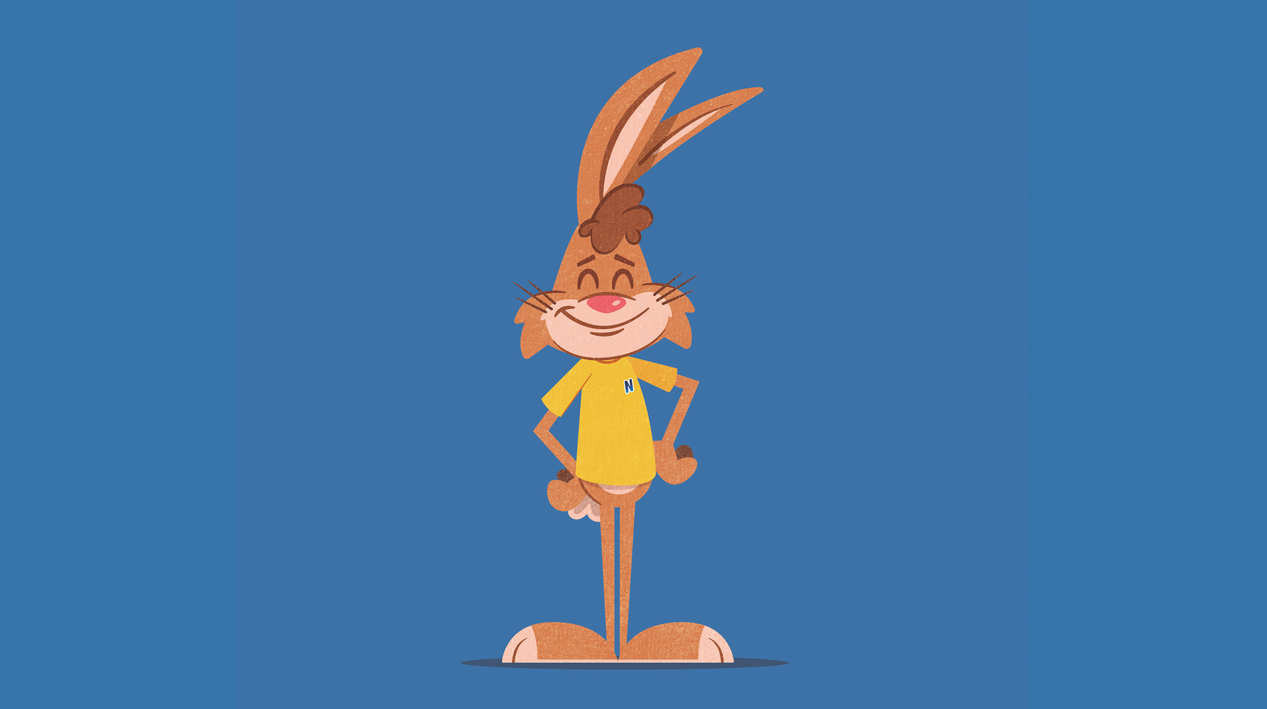
Unfortunately my design wasn't selected, as Nestlé felt they wanted to make the evolution of Quiky a little more subtle. Despite this, I received great feedback and was just honoured to have had the opportunity to work on such a great project.

READY TO MAKE AN IMPACT?
hello@rubberpenguin.com
READY TO MAKE AN IMPACT?
hello@rubberpenguin.com
All designs and concepts are strictly ©2025 Dan Bailey. All rights reserved.